Post Processing Mistakes In Photography Beginners Should Know

There’s nothing wrong with tweaking your photos to bring out the best in them, but all too often people get lazy in their photography, with the intention to just post-process it after in Photoshop. Photography is an art and so it may take some time to get the shot you went out for, but after all the Mona Lisa took four years to complete! Use post processing tools to make those final improvements, and try to avoid making too many ‘changes’, let the natural composition and subjects take the forefront. If you’re not happy with your photo before editing it, then don’t use it, even if you have the best cameras for photography.
Here are some of the most common mistakes made in the post-processing of photos. Whether you use Adobe Photoshop or Microsoft Paint this is going to make you think before you edit.
Bad Cropping
This is probably the worst of the lot, over cropping can result in a bad composition, and there’s nothing worse in photography than a bad composition!

This poor girl is so cramped between the pillar and the edge of the photo! She’s gasping for air, on top of that we can’t see the full voluptuosity of her hair. Give the subject enough space to breathe and show the extent of its beauty. The rule of thirds is a good tool to use in this case, even in post processing.
Black and White in Post Processing
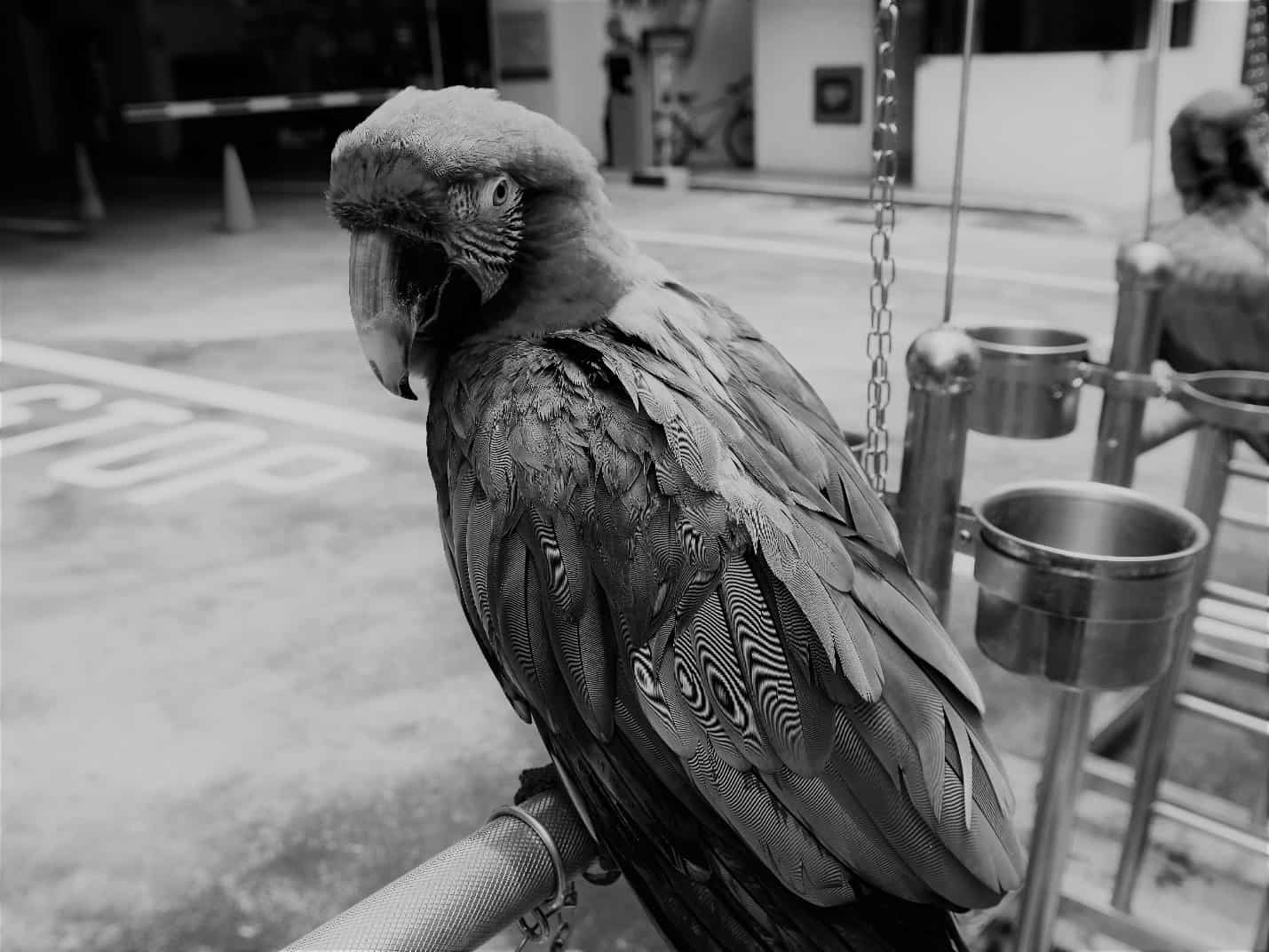
Knowing when to make your pictures black and white is a matter of judgement, but we should certainly take into the account the colours in the photo before adjusting it in any way.

This poor parrot! Its identity has been completely stripped, and now it’s nothing but a dull, dreary looking bird. No color, no character. If your subject is particularly colorful, then dampening the colors in any way is only going to cost the overall visual quality of your image. If of course color does not play a huge factor in the quality of your photo, then, by all means, see if converting it to gray scale improves it.
Too Much Saturation

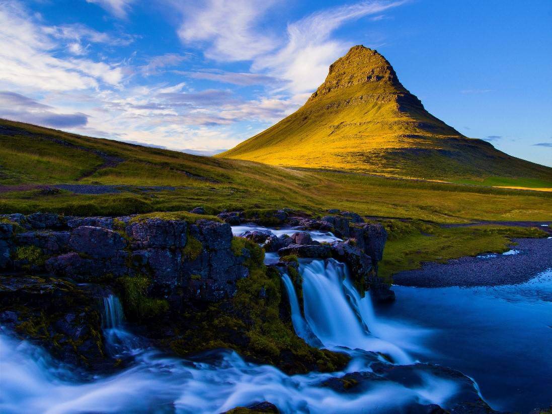
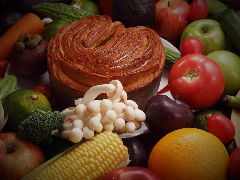
The other common mistake in post processing is too much color, saturation is a great tool for making your photos look more vibrant, but too much can make your images look unrealistic. It’s a mistake often made when you have a particularly colorful subject, it only seems right to increase the saturation to bring out the color against the backdrop. Go easy on the saturation; by tweaking a few other sliders you’ll find a good balance for your image.
Too Much Vignette
This is a tool I very rarely use, because I’ve never seen it have any real benefit to improving photos, and it always just feels like I’m editing a photo to upload to my Instagram. Take more care in the composition and the focus on your subject when you’re taking the picture, and you generally won’t need to use vignette. If you are going to use vignette, don’t overdo it, especially if means sacrificing other details in the picture.
Too much anything
I thought I’d cut this short, not because I’m lazy but given that some techniques are preferred to others, I don’t want to keep repeating myself with every slider you find on Photoshop. It’s great to experiment as a beginner, and I stand by experimentation as the best form of learning photography but keep everything in moderation. Focus on your photography before you delve into Photoshop because you’ll find yourself ruining what was once a good photo even if you have the best cameras for photography.

